When did you last update your LinkedIn profile? If you’re like most people, it’s been a while. Right?
That’s okay, but as LinkedIn completes the rollout of a new user interface, there’s no better time to refresh and update your profile. Here’s a look at what’s changed and how you can make the most of the new features.
Applying the Changes
With this redesign, LinkedIn finally unites the desktop and mobile versions of its platform, for a consistent experience no matter what device you use. According to LinkedIn, the new interface is designed to look like an application, instead of a website. That’s not surprising, given that 58% of unique LinkedIn users access the platform via a mobile device.
While there are many changes to the platform overall, we’re going to focus on the changes to the personal profile page, which is a user’s virtual business card.
Peekaboo!
When you view a profile on LinkedIn, full details are visible only when you expand individual sections. For example, instead of viewing a connection’s entire summary, you now see only about 240 characters, unless you click the “See more” link. A compelling opening line has always been crucial to a good LinkedIn summary, but with this new layout, you have to get to the point quickly.
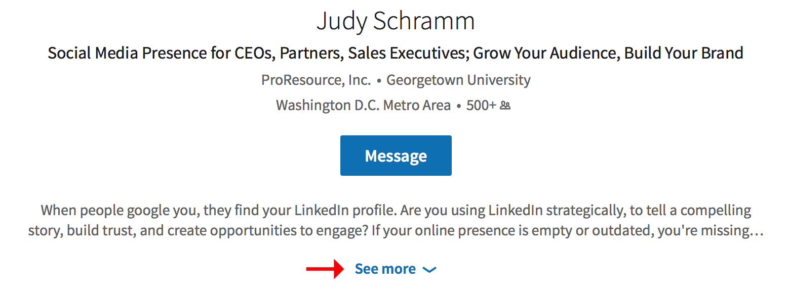
Other changes to the top of the profile include a redesigned headline, and a more prominent display of your current employer.
Only your current job experience is displayed in full; users again must use the “See more” link to expand the view.
Highlights
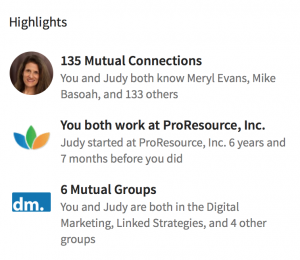
The new layout includes Highlights, a completely new section. Located under the summary as someone views a profile, you can now easily see what you have in common with that person.
Mutual LinkedIn connections, common work history, and group memberships are displayed. This information was scattered across the previous user interface, but the new design helps users quickly find touch points that might help strengthen professional relationships.
After Highlights is another new section, Articles & Activity.
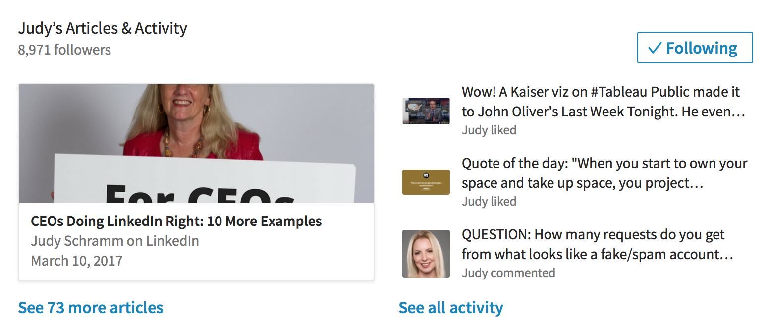
In the past, the link for finding a user’s LinkedIn activities was hidden in a dropdown menu. But if the goal of professional social media is to promote meaningful interaction with business partners and clients, it makes sense to place a user’s recent posts, comments, and articles in a central place. If we want to strike up a conversation with a connection, it is simpler than ever before to notice what they are talking about and step into a discussion on that.
A New Way of Organizing Your Profile
Profile organization is also new; the revamped style includes new titles that cover several sections. For example, Experience now encompasses your work history, volunteer roles, and education.
The Accomplishments section now includes Organizations, Projects, Languages, and Publications.
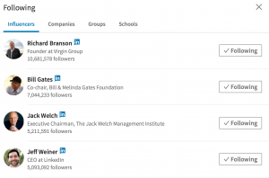
Following includes the Influencers, companies, schools, and groups you watch on LinkedIn.
Endorsements now highlight the people who gave that endorsement, so acknowledgments from mutual connections and experts carry greater weight.
Photo Shoot
The biggest change to profile graphics is the shape of an individual’s profile photo. Previously, LinkedIn allowed users to pick the picture shape; now all profile photos are circular. It’s worth taking a look at your profile photo in light of this change because the new shape can affect how you position or crop your photo.
While you’re at it, consider a new LinkedIn profile photo. It’s a great conversation starter, and it keeps a profile looking fresh.

The background photo, which is the graphic that appears behind a profile photo, is no longer optional. If you do not upload a personalized background photo, by default LinkedIn adds a generic blue graphic, like the one above.
But we recommend adding your own graphic – it’s a simple way to add some personal flair to your profile page and tell your story in a visual way.

The dimensions of the background photo also changed, going to 1536 x 768 pixels from 1400 x 425 pixels. They almost doubled the depth and just increased the width slightly, so the new shape will have implications for images.
With the site’s new responsive design, how the image is displayed changes on different devices. If you have a graphic with your brand, know that you can’t control where your logo appears or what text will be visible on different devices.
But Wait, That’s Not New
Right off the bat, many readers are scrolling down to the comment box to electronically opine they’ve been using the new layout for ages. That’s because LinkedIn typically rolls out new services and designs in stages, testing and refining the user experience over time.
From what we’ve seen and heard from our clients, everyone has the new interface now, even light users with free accounts.
LinkedIn constantly refines the user experience, beta testing new ideas and improvements across the platform. I’m sure there will be more changes to the platform soon.
Who Has the Time?
Take this new layout as impetus to reevaluate your LinkedIn profile, and make some changes to send you into the spring with a fresh, professional look.
Of course updating your profile takes time, which is always in short supply. That’s where ProResource can help. We offer several profile makeover options depending on how much updating you want to do. Our website also offers free resources on building the perfect LinkedIn profile.
Don’t miss this chance to update and polish your profile on LinkedIn, and let us know if you’d like professional assistance. We help all of our clients put their best foot forward online, moving towards new business opportunities.

